What’s Trending: Residential Paint Colour Forecast for 2026
01 December 2025As we look ahead to 2026, the world of home paint colours is evolving in ways that reflect both emotional grounding and bold self-expression. Designers and colour experts agree: the palette is shifting toward richer, warmer hues, nature-inspired tones, and layered sophistication. Here’s a breakdown of the key trends shaping residential paint choices next year.
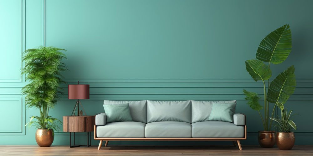
1. Nature-Inspired Greens & Teals: One of the strongest motifs for 2026 is a deep connection to the natural world. Sage greens, smoky jade, and rich teals are emerging as go-to shades. Behr’s “Hidden Gem” — a smoky jade that blends blue and green in a soothing yet striking way — has been heralded as their new neutral. Valspar’s “Warm Eucalyptus” brings a gentle, grounded green that pairs beautifully with earthy textures and natural materials. According to design experts, these colours provide a calmer, more restorative feeling, perfect for bedrooms, offices, or any space meant for relaxation.
2. Warm, Grounded Neutrals: Gone are the days of sterile white and cool greys dominating interiors. In 2026, the focus is on warmth, depth, and timelessness. Sherwin-Williams’ “Universal Khaki” (SW 6150) is their 2026 Colour of the Year — a soft, sun-warmed neutral with subtle taupe and green undertones. Dutch Boy’s “Melodious Ivory” offers a creamy, mellow beige that feels both comforting and elegant. These neutrals work beautifully across whole rooms (or even entire homes), and they’re especially effective when used in “soft colour drenching” — painting walls, trim, and ceilings in the same tone for a cocooning, seamless feel.
3. Moody Rich Tones: Browns, Burgundy, Plum: For those wanting more drama and depth, 2026 is the year for richly saturated colours that still feel grounded. Glidden’s “Warm Mahogany” is a deep, red-toned brown that designers are calling “moody but approachable.” Jewel tones also continue to make a statement: Graham & Brown’s “Divine Damson” is a bold, dark cherry-plum that exudes sophistication. Little Greene’s “Adventurer” (plum-aubergine) is being positioned not just for accent walls, but for restful, intimate spaces like dining rooms and bedrooms.
4. Uplifting Yellows: Yellow isn’t fading — in fact, it’s shifting toward softer, more optimistic tones. Designers predict continued popularity of butter yellow, which brings warmth and cheer without overwhelming a room. These sunny hues are especially suited to kitchens, breakfast nooks, or any space where a subtle boost of brightness is welcome.
5. “Earthy Vibrancy” — A New Design Mood: A broader trend underpins many of these colour picks: what experts are calling earthy vibrancy. This aesthetic combines warm neutrals, rich jewel tones, and organic hues — think ochres, olive greens, muddy blues, and deep plums.
To use these colours effectively in your home, start by creating whole-house cohesion with a neutral like Universal Khaki on the walls, then layer in richer tones such as teal or plum through furniture or accent walls. For a bolder look, try colour drenching by painting a small room—like a powder room—in a single shade from walls to trim to ceiling. Use moody reds or plums as accents in dramatic spaces such as dining rooms, entries, or bedrooms, and reserve calming greens for restful areas like offices or living rooms. Finally, enhance any of these palettes by pairing them with natural textures such as wood, linen, or clay to bring warmth and authenticity to the overall design.The goal is to create spaces that feel both grounded and emotionally expressive, layered and timeless rather than fleeting.
Sources: jane at home; Good Housekeeping; Homes and Gardens; ELLE Decor
Photo credit: https://www.vecteezy.com/photo/28217280